
Why your website has to work well on a phone
By the Vertcl team · 25+ years building websites for South African businesses · Updated · 3 min read
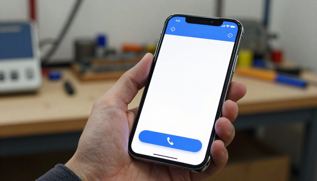
Quick answer
Most local searches happen on a phone. If your site is awkward to use there, the visitor simply leaves.
Most visitors arrive on mobile
People look up businesses while out, on the sofa or between jobs, and they do it on their phones. For many small businesses, the majority of visits are on a small screen.
Think about how your customers search
A homeowner whose geyser has just burst is not sitting at a desk. They are standing in the passage with a phone, looking for someone to call. A parent looking for a clinic searches from the car park. A newcomer to town checks church service times on Saturday night. In each case the phone is the main way they find you.
In South Africa, data costs money, and many people use mid-range phones on mobile networks rather than fast fibre. A site that is built only with a large office screen in mind can frustrate exactly the people you want to reach.
What good looks like
Text should be readable without zooming, buttons large enough to tap, and the main contact option easy to reach without scrolling far.
Pages should load quickly on an average connection. Oversized images are the most common reason they do not.
The basics of a good mobile page
- Text large enough to read without pinching the screen
- One column of content that fits the width of the phone, with no sideways scrolling
- Buttons and links spaced apart so a thumb does not hit the wrong one
- A phone number that dials when tapped
- A short form that is easy to complete on a small keyboard
- A menu that is simple and opens and closes without fuss
Keep pages light
Photos taken on a modern phone can be several megabytes each. If they are placed on a page without being reduced in size, a visitor on a mobile connection waits and may leave before the page appears. Ask whoever builds or maintains your site to resize and compress images before they go online, and keep the number of large images on the first screen small.
Avoid auto-playing videos and heavy animations on the home page. They look impressive on a fast computer and slow everything down on a modest phone.
Test it yourself
Open your site on your own phone and try to find your services and send an enquiry. If anything feels fiddly, your customers feel it too.
A ten-minute phone test
Do this on mobile data rather than your office wifi, so you see what a customer sees.
- Type your business name into Google and tap your website
- Count how long the first screen takes to show up
- Without scrolling, can you see what you do and how to contact you?
- Tap the phone number. Does it open the dialler?
- Open the menu and visit three pages
- Fill in and submit the contact form
- Turn the phone sideways and check the page still looks right
- Ask someone with an older or smaller phone to try the same
Write down everything that irritated you. That list is your to-do list.
Worked scenarios
The electrician on a call-out
An electrician in Johannesburg gets most of his enquiries from people with a fault, such as a tripping board or no power. His old site has a long home page with a small phone number at the bottom. Visitors on phones scroll, give up and call the next result. He asks for a large "Call now" button at the top, a short list of the faults he fixes and a line saying which suburbs he covers. His site now answers the main question quickly: can he help, and how do they reach him?
The clinic with a booking problem
A small physiotherapy clinic in Bloemfontein has a booking form with twelve fields, and several are dropdowns that are awkward on a phone. Many patients start the form and never finish it. The clinic cuts it to name, number, preferred day and a short note about the problem, and adds a tap-to-call button for people who prefer to speak to reception. The form is now something a patient can finish in a minute while waiting in a queue.
The church with an old PDF
A church publishes its service times and notices as a PDF that has to be pinched and zoomed. Visitors on phones struggle to read it. The church moves the times, address and a map link onto a normal page and keeps the notices short and in text. First-time visitors can see when to arrive and where to park without downloading anything.
Common mobile problems and simple fixes
- Tiny text: increase the base size and avoid long, dense paragraphs
- Buttons too close together: add space and make each one a comfortable tap target
- Slow pages: reduce image sizes and remove anything you do not need
- Hidden contact details: put a call or message button near the top of every page
- Pop-ups that cover the screen: remove them or make them easy to close
- Menus with many layers: simplify to a handful of clear options
- Text inside images: write it as real text so it can be read and tapped
Mobile and search
Google looks at the mobile version of your site when it decides how to rank it. A site that is slow or awkward on phones is less likely to appear near the top for local searches such as "plumber near me" or "painter in Stellenbosch". A good phone experience helps customers and helps people find you in the first place.
When you update the site
Every change you make should be checked on a phone. A new price list, a photo gallery or a table of services can look fine on a computer and break on a small screen. Make checking on your own phone part of the routine each time something changes.
If you use a provider to manage updates, ask them how they test new pages on mobile and whether that is included.
A quick summary
A website that works well on phones is not a luxury. For most local businesses it is the version of the site that most customers will use. Make the text easy to read, keep pages light, put your contact options within reach, and test it yourself on a normal phone and a normal connection. The effort is small, and it removes one of the most common reasons people leave before they get in touch.
A checklist to give your web designer
If someone else builds or maintains your site, these are fair things to ask for.
- Show me the site on a real phone before it goes live
- Make the phone number tap-to-call on every page
- Keep the contact form to the fewest fields possible
- Resize and compress all photos
- Keep text readable at its normal size
- Check the site on both a newer and an older phone
- Tell me how quickly the home page loads on mobile data
A good provider will not mind these questions, and the answers tell you a lot about how carefully they work.
What about a separate mobile site?
You do not need one. A modern site adapts to the screen it is shown on, so one site serves computers, tablets and phones. Be wary of anyone who suggests a separate version, since it means two sites to keep updated.
Small habits that help
- Look at your site on your phone once a month
- Ask a new customer how they found you and what device they used
- Notice which pages people visit most and make sure those are the easiest to use
- Remove outdated pages and offers, which add clutter on a small screen
Special cases worth planning for
Load shedding and patchy signal
Power cuts and weak signal are part of life for many customers. Pages that are light load more reliably when the connection drops to a slow speed. Keep the essentials, such as your number, your area and your hours, as plain text near the top, so they appear even if the images are slow to arrive.
Older phones
Not everyone has the newest handset. Simple layouts, normal fonts and limited animation work on a wider range of devices. If your site works for a customer with a five-year-old phone, it will work for nearly everyone.
Maps and directions
If people visit you, add a map link that opens directly in their maps app, plus a written address and a note on parking. A painter's workshop, a clinic or a church is much easier to find when the visitor can tap once to get directions.
Questions this article answers
Written by
The Vertcl team
We build websites designed for specific industries, so South African trades and practices get a professional site without starting from scratch.
About Vertcl